Sondra's Somewhat Scrappy Blog
  • Blog
  • Home

Holland

7/11/2014

 
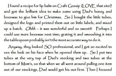
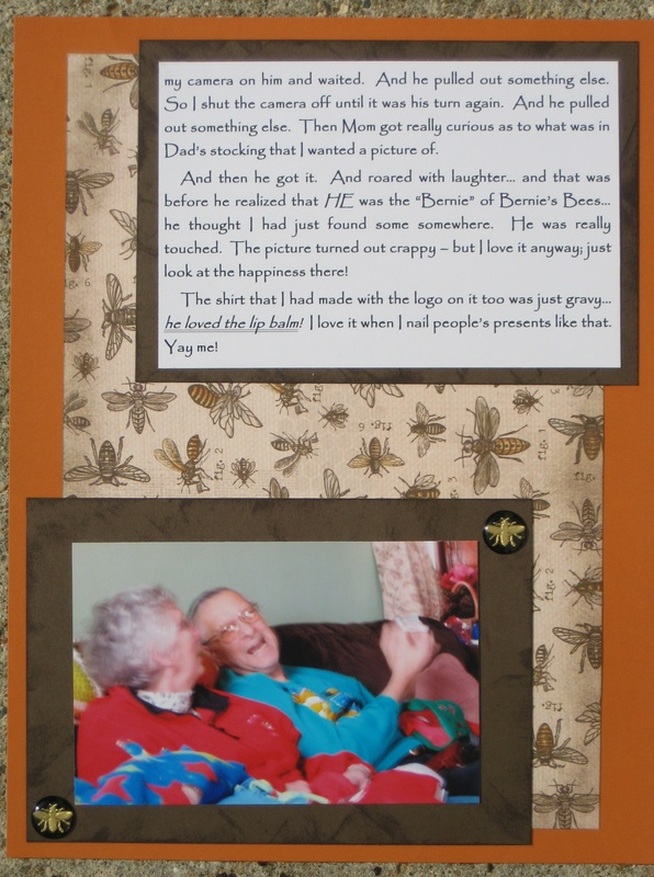
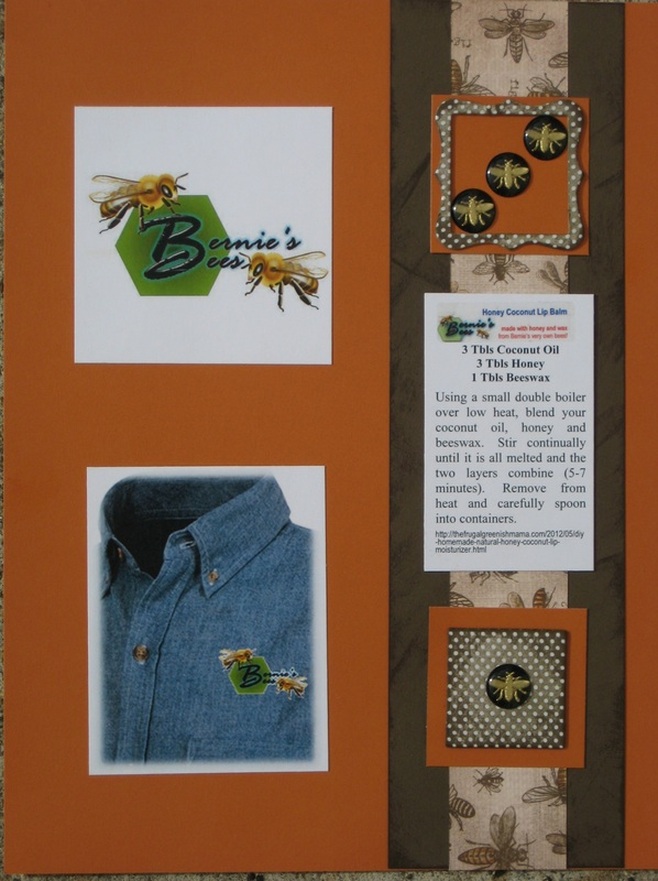
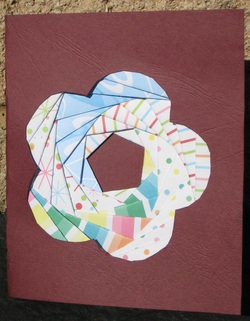
I took an on-line class in mixed-media techniques for scrapbooking.  As with everything, I'm sure that practicing is important... but I even like the raw attempts.  However, you can't actually SEE any of the texture paste underneath the watercolors... the only texture provided is from the collage effect of the pieces.
Picture
I do like the texture paste.  I just need to add drier paper pulp to it next time.  Here's the recipe:
  • 2 parts paper pulp
  • 1 part Modge Podge
  • 1 part Gesso

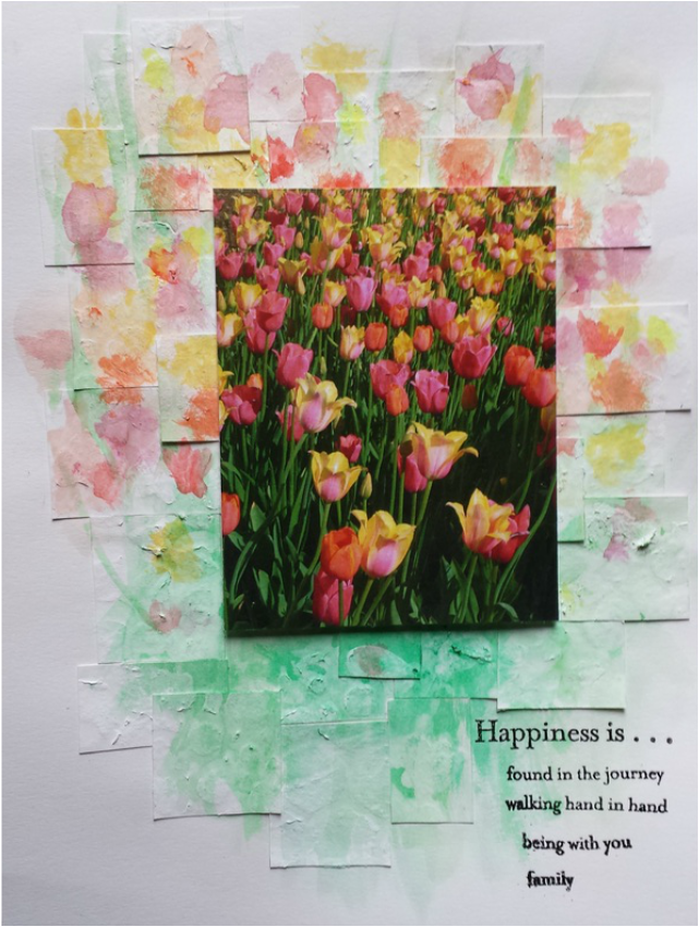
I love this picture.  It's from our trip to Holland, Michigan, to see the tulips on Mother's Day.  This was my favorite non-family-member picture from the day (from a choice of >100 pictures!!!). No, darling Peeps, I didn't go crazy with the camera! What were you thinking??? :o)

Playing with the Close To My Heart Artbooking Cartridge

8/30/2013

 
Picture
When I saw the project that our Close to the Heart representative had for us to work on this month, I was thrilled.  It was just PERFECT for the pictures we had taken the weekend before on a jaunt to Pennsylvania.

She had everything already cut, from the woodgrain to the title, die cuts and photo mats.

I printed out my pictures and then realized that I was going to need more than the two pages our kit included.

So I emailed my friendly CTMH rep and asked if I could purchase a second kit.  When she said yes, I started squishing my journaling into a 4 x 6 block.


Picture
journaling reads:

"We went to Cook's Forest in Pennsylvania and did some hiking.  We climbed the fire tower, hiked on and around some giant boulders at Seneca Point, and hiked a couple of the trails at the Forest Canopy.
The Longfellow Trail has hemlock trees that are over 400 years old.  The Ancient Forest Trail has some of the tallest concentration of old growth white pines in the Northeastern US and several "cork barks"  in which the cork layer had grown so thick that it changed the appearance of the bark.
We also did some canoeing on the Clarion River.  As the river was low, three people in a canoe would have involved a lot of bottoming-out, so Shannon went in a kayak.  She loved it and wants to get one for our dinky little pond.  The river was gorgeous and lined with rocks that only occasionally grabbed hold of the canoe and kayak and didn't want to let go.  We were able to get through without getting out to push; I was worried that wouldn't be the case, so I left my camera in the truck.  Spent the whole day in Pennsylvania and had a wonderful time!  8/11/13"

Picture
I love the woodgrain on this cartridge.  It almost makes me wish that I  had a Cricut... don't tell my Beloved Big Shot Pro.  I wouldn't want to hurt "Biggie's" feelings.

A
nyway, I have dies very near to the other die cuts included.. which was everything but the flowers.  I swiped some of my daughter's Stickles to accent the branches, rather than trying to do it at the crop.  I am FAR TOO MESSY to attempt hauling that home without getting it all over me and my poor truck!

The die cuts seemed a little flat to me, so I dug out my chalks and cut a mask from a grassy border die for the trees.  I chalked them in a couple different colors and love the subtle texture that it gave.  So I went further and chalked the branches too.

It still wanted something else, so I punched out some hydrangea flowers out of vellum and glued them down.  They then seemed to scream for bling, so I put an adhesive rhinestone in the center of each.

Picture
I love these little monthly get togethers that our rep puts together for her "club girls"... especially when I can knock out a layout (well MOST of a layout anyway) in one night.  As my beloved Peeps know, I am not a 30 minute scrapper by any stretch of the imagination.

Anyway, now that I have seen some of the things on this little ole Cricut cartridge, I'll be cozying up to my dear buddy, Lisa, and my favorite (don't say "only"... I'm going for some schmoozing here!) sister who both have it.


ps... Yes that really is me to the right, hugging a tree.


My Daddy and his bees

4/22/2013

 
This was a kit from my Creative Memories consultant from their Buzz and Bumble line.  I reworked it a bit to change it from the 12 x 12 layout to my favored 8 1/2 x 11.  When I saw what this month's project would be, I knew that I had finally found the perfect layout for my story.  I've been buying bee-themed products ever since I made this lip balm, just knowing that I was going to record it.  I even got the camera ready (but not with the "right" settings I'm afraid) to snap this one-shot-only picture.  So it is out of focus and full of motion blur.  But, as are most of my layouts, it is more about the story than the pictures anyway.
Picture
This is the first of two pages of journalling.  It fits into a page flap over the top of the second page.  The lovely little flip flap adheres right to my page protector to protect all of my layout  from sticky little fingers.

Picture
Picture
Picture
I really love the simplicity of this layout, the clean lines and minimal embellishments that is so contrary to my normal style.  As is the fact that this was completed in ONE SITTING!  The only scrapbook products in this that were not part of my kit, were the black and gold acrylic bee bubbles that I picked up in the clearance section at Hobby Lobby.  But they fit so perfectly here, don't you agree, my beloved Peeps?

Lunch With My Ko's Buddy: A Mixed Media Piece

4/15/2013

 
Picture
Picture
I had a lot of fun playing with this layout.  I used some old favorites: lace, stamping, Stickles, and bling.  I also tried some new things such as extending my picture into the background with paint, attempting Flower Soft, using rubons, and my first crack at pergamano (parchment crafting) for a fan.

I used green marbled vellum instead of parchment paper.  I didn't find out until I was almost done that vellum is a poor choice.  I still like how it turned out.  Next time I'm at a craft store, I'll have to see if they have the "real" paper and tools for my next shot at it.

I just wanted something different and fun to remember these times.  I really do look forward to lunch on Fridays.  It's great to kick back and forget about the "real world" for a little while.  Here's hoping that all of my Peeps have the same opportunity!

Making Embellishments with Shrinky Dinks

1/22/2013

 
Picture
As all of my Peeps know, I LOVE Shrinky Dinks.  The above picture is a before and after baking... for those of you who have never had the pleasure of playing with them.  I knew that I wanted evergreen branches on my layout... and couldn't find anyone willing to let me cut up their GOOD QUALITY Christmas tree.  (And they call themselves "friends"!)  So I grabbed my Shrinkies and my Prismacolor colored pencils.  (THANKS AGAIN, Mom and Daddy for one of the BEST Christmas presents ever when you started my collection of those lovely pencils!!!)

I found an image online and printed it out.  I then lightly traced it with the colored pencils until I had the shape and then I started coloring it in.  I decided that I wanted the look of the needles, so I meticulously cut around the needles as you can see where I started that near the bottom of the lower branch.

They honestly turned out SO much better than I was expecting!  My art professor would be so proud.  He so wanted me to get into scientific illustration, but I just wasn't cut out for it.  THIS is MUCH more fun!!!
Picture
Picture
See how nice they look on the layout?  I chose colors for the branch to match the fabric patch near the top of the page.  The alpha stickers were some I'd had forever.  But I absolutely fell in love with the satiny embroidery floss that I used to cross stitch the border with.  I bought it at Joann Fabric and then couldn't find ANY paper or cardstock to match it!  Until I got home.  It is hard to tell by the picture, but the floss is actually only a half-shade lighter than the cardstock... it is just really satiny and caught a lot of light in the picture. 

I finally found some fabric that I loved anyway, so I used it in lieu of patterned paper.  The circles were things found on the Internet: a Bible quote, a bit of song, a bit of subway art, a bit of story, a snippet from Wikipedia on wreaths, and a list to Santa that I typed up.  A cut with a circle punch, a bit of staining with tea and they were all ready to Modge-Podge onto my fabric. 

I also surfed the web for cross stitch patterns and found several that I made into a border along the edge.  A note to self:  Only do one layer of cardstock when doing cross-stitch, it is too hard to line up the holes on multiple layers.

This was a challenge layout.  I really like the neutral cream and sage combination and may use it again and again.  I also had fun making my text match the theme... if anyone doesn't read it, it takes nothing away... but if they do, it's another layer to the page.

So have you played with Shrinky Dinks (or other shrink film)?  What do you think of it?
 

Old Blue

1/8/2013

 
Picture
Here is December's sketch from My Creative Sketches.  I really loved this one... and as usual, went crazy with it!  I die-cut three circles out of my background paper using an eyelet circle set.  I was thrilled when the resulting outside cut looked a bit like gears!  I then used various dies to cut snowflakes and gears; I cut the title from Sizzix’s Alphabuckle alphabet set.  I painted all of them a metallic turquoise blue.

I then took the snowflakes and grouped them, spraying them with varying amounts of silver metallic paint.  I was going for an hombre effect.  I don’t know if I really achieved it, but I love it all the same.   I was afraid the blue on blue wouldn’t show the title well, so I covered the alpha (but not the buckle part) in black Stickles
.


Picture
Picture
For the background paper, I did not clearcoat it, as I did the snowflakes.  I used Versamark to stamp various snowflakes around the page.  I then heat-set clear embossing powder onto the images to give it dimension and to carry the snow theme of the page.

The snowflakes stamps repeat... I don't have enough to make them all unique as I did the dies and brads...
            yet...

Picture
I love the challenge of journaling in shapes, so I opted to put my journaling where the title was supposed to be and my title where the banner was.  I intended to “hang” my title… forgetting until I cut them out, that Alphabuckles attach at the bottom and not the top.  By then, I was already favoring stringing them onto baker’s twine… so I thought to hold the larger letters down with another strand across the top.

And as a lot of my pages don't really allow for bling, I let myself bling it up with this one.  There is no stitching on the layout, which I've really been into lately.  However, I'd almost forgotten how much I love paint.  Crazy!!!

What is your favorite way to be creative on your layouts?


A Layout Progressing Through Errors.

12/31/2012

 
Picture
I just wanted to record a little story about how my Aunt Bonnie has been cooking the family dinner at various locations for years and years.  I even tortured the poor woman trying to get the "perfect" shot(s).  I tried a new stitch out at the bottom... and then covered most of it up.  The pictures I sent to a local pharmacy for printing.  Twice.  before they actually showed up in the pick-up bin.

I printed out my journalling on a lovely light turquoise and punched both sides with a border punch.  I excitedly laid it next to the stitching to see how it worked.  And then I realized that it clashed with the light blue I used in my stitching.  So I redid it in white.  Then I adhered all of my lovely layers.  And THEN found a journalling error.  So I made a second white layer.

And I had the perfect colored GLITTER letters.  It had two different colors in the package... and the darker one was perfect.  A cursory glance showed that it would work.  And I get to the final letter... the "A"... and realized that the capital one was the lighter color... which I could have made work, if I had alternated them the whole way through... but this was the VERY LAST LETTER to adhere.  So I searched the alphabet and found a "V" and a swoosh.  Yeah!  Perfectly fancy A.  Then I stepped back and realized the title was off-centered, so I added a swoosh to the bottom.  

Stepping back, I realized the turquoise and red in my title block were of similar darkness and that made the title hard to read.  So I experimented on a scrap and found that outlining them in a extra-fine black sharpie made it readable.

So after many stops and starts... I finished it.  A single page layout.  ta-DAAAH!  However, do people accomplish 30 minute layouts???


Picture

My Brunette

11/27/2012

 
School pictures are so much nicer than in the Middle Ages when I was a kid.  No more plain old boring grey backdrop.  Now you can go on-line and choose from a wide array of backdrops, they shoot the kids in front of a green-screen, and VOILA!....  custom pictures.  They even shoot one shot of the kiddos and get a full-length or a headshot.... whichever you choose.

I couldn't decide between my favorite cobalt blue... or the brown collagey/scrapbooky one.... so I got both.  Which worked out well... because once I decided what I wanted to say, it was hard to stop!  I needed two pages!!!  I went simple on the decorations... solid cardstock die-cuts, inked with background stamps and embellished with brads, french knots, and Stickles.
 
Picture
Picture
The journaling reads:  "Could it be me?  That maybe I don’t know what I want???  13 years ago, I wanted a redheaded baby.  When she was born with light-colored hair, I clung to hope as red would shine through in certain lights.  Then her hair came in as the most magnificent near-platinum blonde & nothing could be better.  I would also cringe when brunette friends would tell me that their hair was that color at that age; that it would darken, & I refused to believe that such a thing could happen.  And I was right… she stayed blonde.

Then this year, she decided to dye it… to take her dazzling blonde and make it plain old brown.  As I could not talk her out of it, we bought the dye & colored it.  And it is gorgeous.  Plus with the new contacts (that I wasn’t for either), she looks so much older than 12!  And I cannot think of anything that suits her as well as this new look.

And now she has decided to go back to blonde… “just for a little while”… & I want to talk her out of it.  Seriously, she is just so stunning as a brunette.  But maybe I am the one who doesn’t know what is best?  That couldn’t be it, could it?  I mean, honestly… look at her!"


Picture
So what do YOU think, my Peeps???  Blonde or Brunette?

Bad Bob and the Backstory

11/20/2012

 
Picture
I have known Bob for years and years and years.  We work in the same facility but in different groups.  And as my Peeps know, I only pick on people I actually like... and I believe that Bob is the same.  We really, really enjoy harassing each other.  In fact, some people who have gotten caught in the cross-fire, have actually been concerned by the seemingly mean comments flying around.

But still, I had no intentions to scrap a page about my odd friendship with my "nemesis"... until I came into work and found this parking sign by my desk.

I absolutely love it.  And he made the whole thing.  For me.  So I gave him two days notice that I was taking his picture.  And so this layout was born.

(My friends at work were a tad concerned that I looked so very happy to be choking him... but I like it!)  It did print out a little dark, I think next time I print pictures, I'll try it again and see if it comes out better.

Picture
Picture
Not too much craziness on this layout.  I used my MS Punch around the page set (the Spiderweb One that Susan bought for me)... fudging it in the middle of the long side to get the full eleven inches.  All three pictures were cut with Lifestyle/QuicKutz dies, the matte with a Spellbinder.  Two colors of ric-rac, a button and some stickers did it for the embellies this time.

I did do a bit to the paper, of course.  I stamped the pumpkins in white on the kraft and then ran my journaling through the printer.  Worried that the (printer) ink would smudge as it sometimes does on scrapbook paper/cardstock, I decided to clear it... so I added orange mica to the clear coat.  It doesn't show up except in bright sunlight... so I smudged some extra mica along the spiderweb edges.  And I glued some black glitter down to the background to peep out around the spiderwebs.  'Cuz you can NEVER have too much sparkly.... right, my Peeps???

A Couple of Iris Folding Projects

10/22/2012

 
Picture
Here is a birthday card I made for a relative.  It is kind of thick with all of the folded paper... but it looks really nice.  I love the cardstock... I picked it up at a fleamarket out in Amish country this summer.  It reminds me of classic books from the library.

The next project is another color/sketch challenge.  I really love the colors, they went PERFECTLY with the picture I had of a dear friend hamming it up for the camera.  I had tons of fun working on this one, as ideas kept rolling in the further I got into working on it.

It is hard to read, but the journaling reads "Lisa kissing a concrete frog outside of Lynn's Paradise Café."

Picture
Picture
As I said, I had so much fun working on this one.  The vision I had when I started looks nothing like how it ended up.  The iris folding idea didn't occur until after the stitching was underway.  I have some thankyous to give out...  Thanks to Kay for volunteering to buy buttons for this layout and finding the lovely crowned frog featured to the right.  And to Serene for the lovely crocheted flowers that I am GOING TO HAVE TO LEARN TO MAKE.... someday.  And to Miss Thing for giving me the Zwinkie or Squishy or whatever it is called and letting me bisect it to fit on the layout.

And to Kim at Big B for the wonderfully detailed directions on the interlaced band stitch.  It was just PERFECT for this and so easy with her directions!!!  I hate to admit, but I bought the book that she is using to learn these stitches, but much prefer going to her website instead!

I got the image for the frog paper-piecing here.  I embellished it with some eye brads.  The crown at the top was a die cut that was embossed with gold embossing powder and bejeweled.  This has been my favorite layout to date and I hope that something on it inspired you.  Thanks for looking!
 

<<Previous
    Picture

    Categories

    All
    Backgrounds
    Beads
    Bugs
    Card
    Christmas
    Crafts
    Digital
    Folding
    Free Sketch
    Friends
    Pergamano
    Pets
    Pop Up
    Presents
    Santa
    Scrapbooking
    Shrinky Dinks
    Stitching
    Texas
    Tree

    About Me

    Scrapbooking is the self-medicating therapy I use to deal withthe stresses of  being a slightly less-than adequate housewife, mom of a pre-teen, and full-time laborer with great responsibilities but no real power. 

    So I take pictures of things in my life and tell funny stories about the memories and immortalize them forever in with various artforms into my scrapbook.

Powered by Create your own unique website with customizable templates.